

Raizana Tea
The Mission
Pablo from The Raizana Tea Company wanted a new look for his line of 14 wellness and sipping teas. He asked me to come up with an updated look for the labels and find new packaging to match, all in time for the Fresno Food Expo.
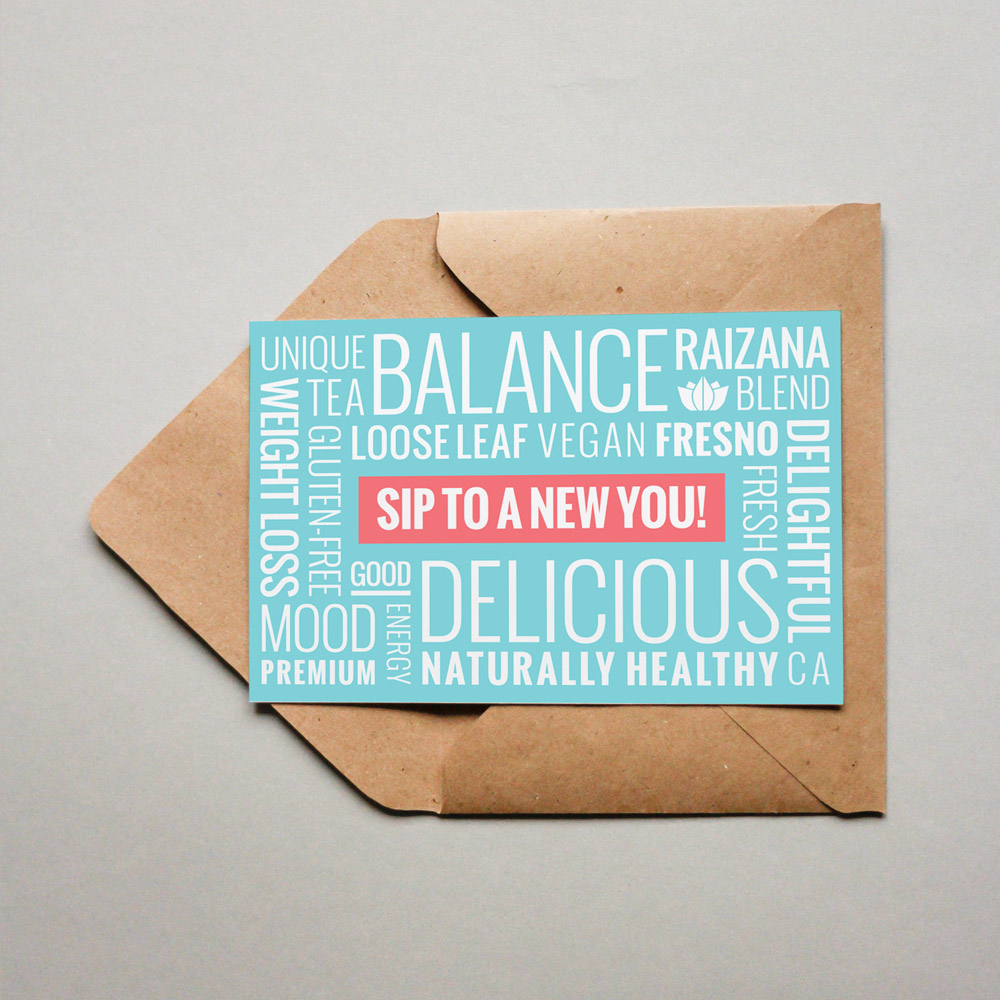
I was also entrusted with designing his company’s advertising postcards, business cards, and a banner stand.
The Execution
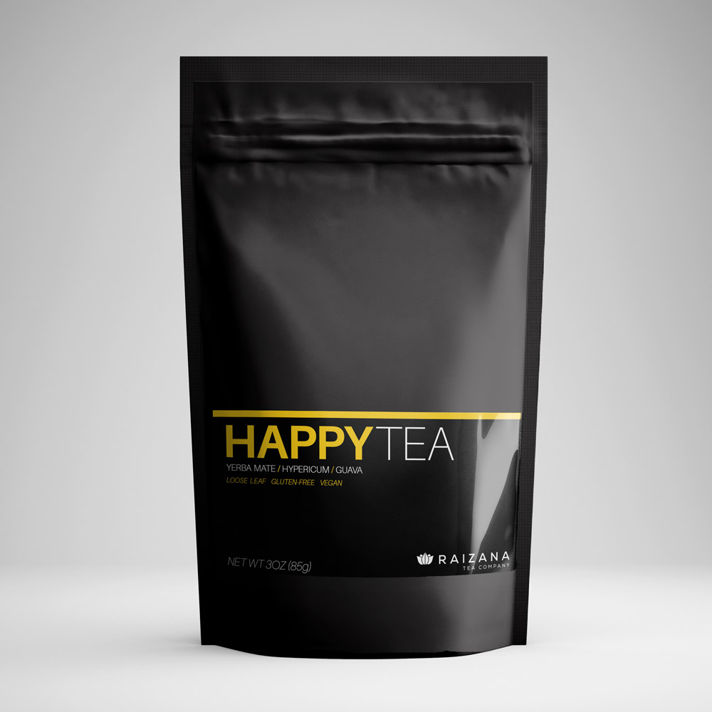
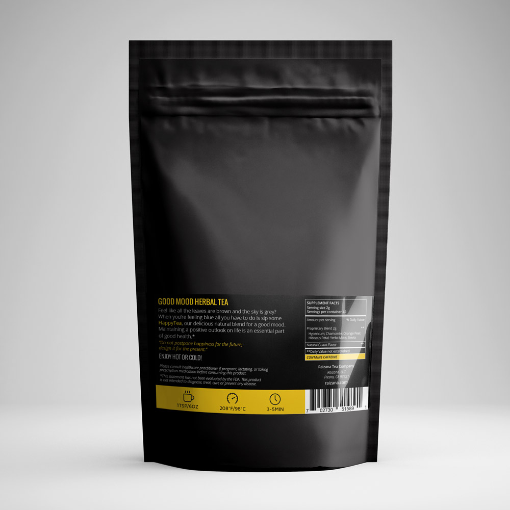
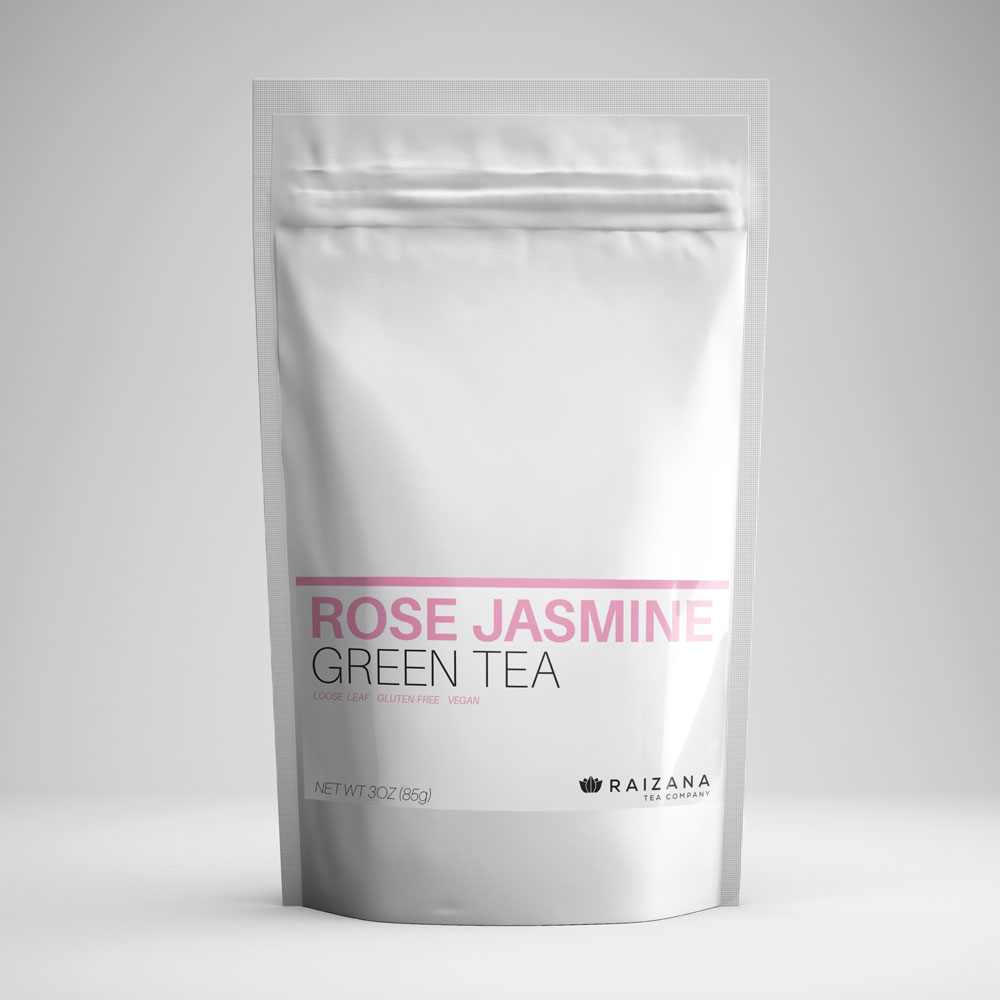
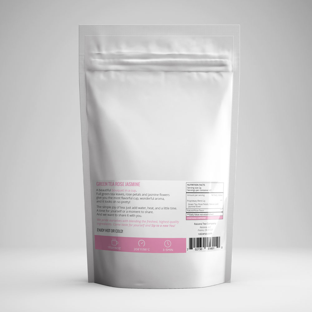
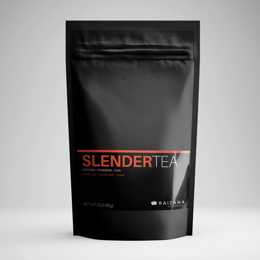
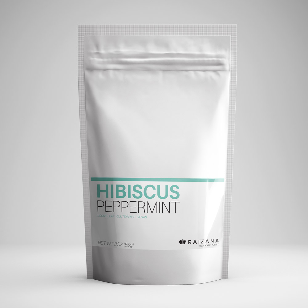
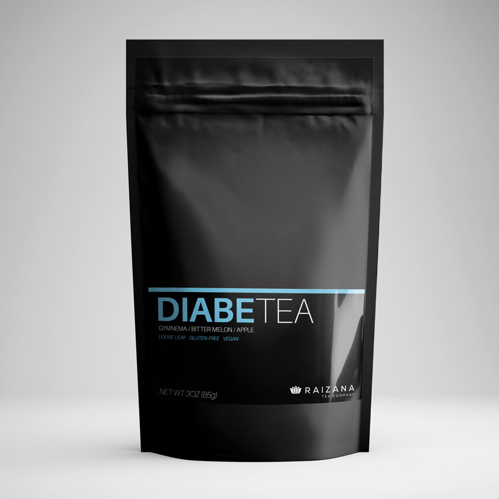
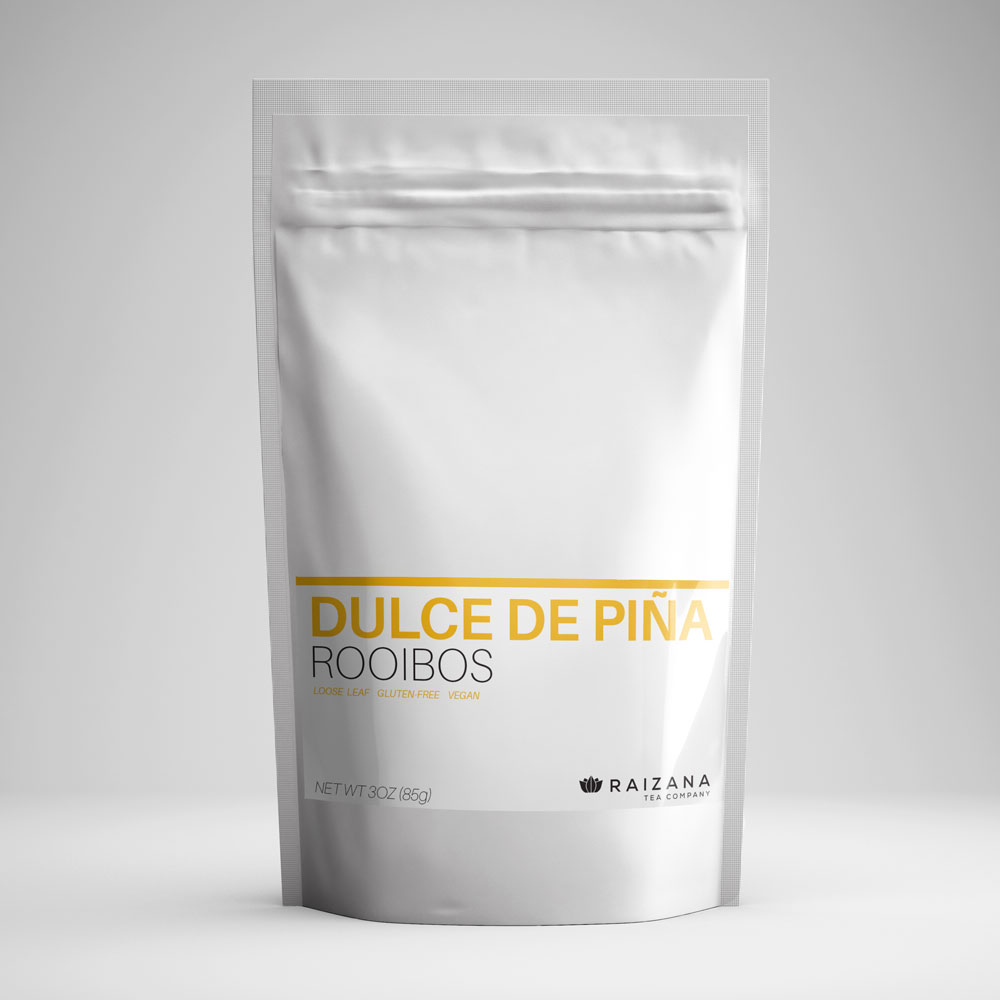
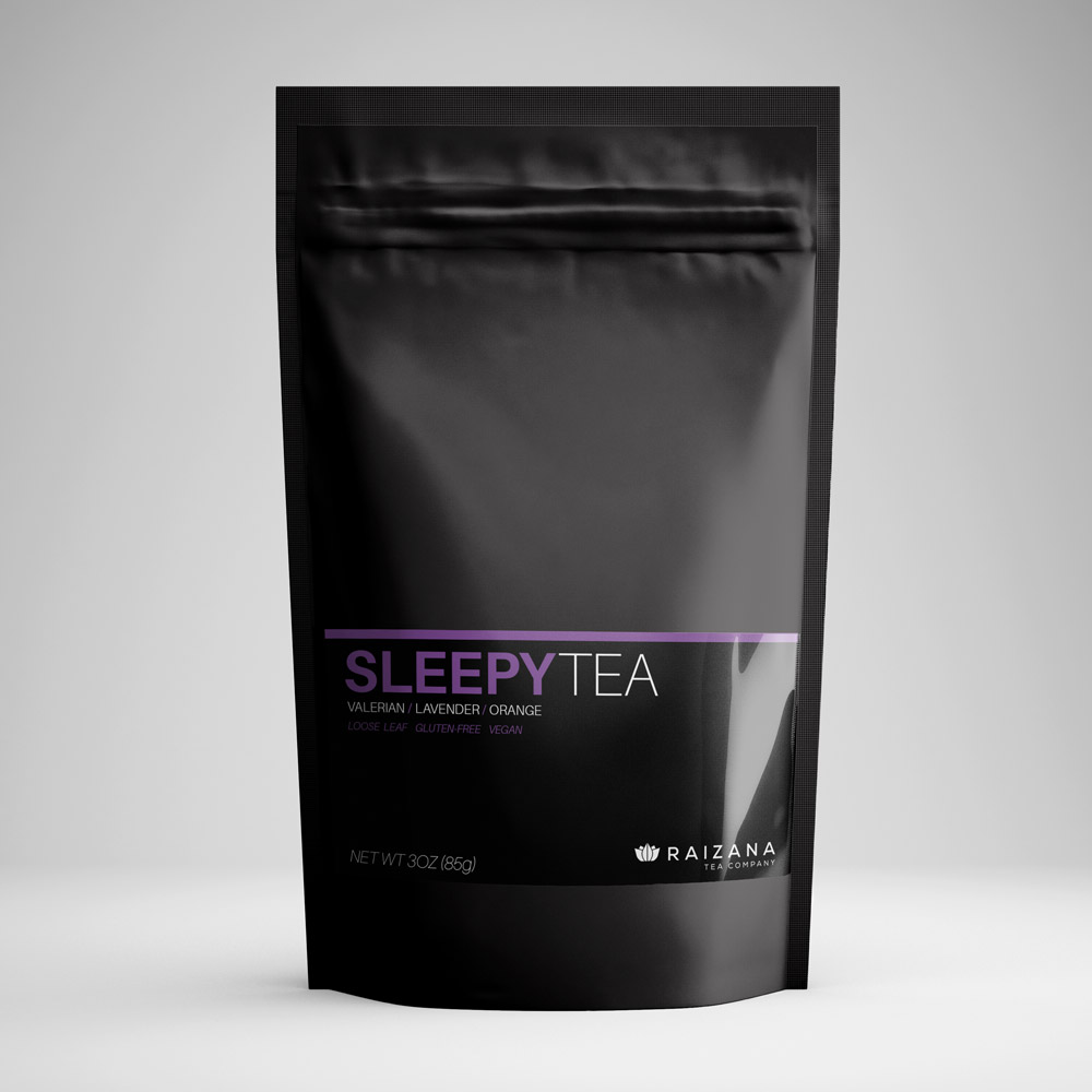
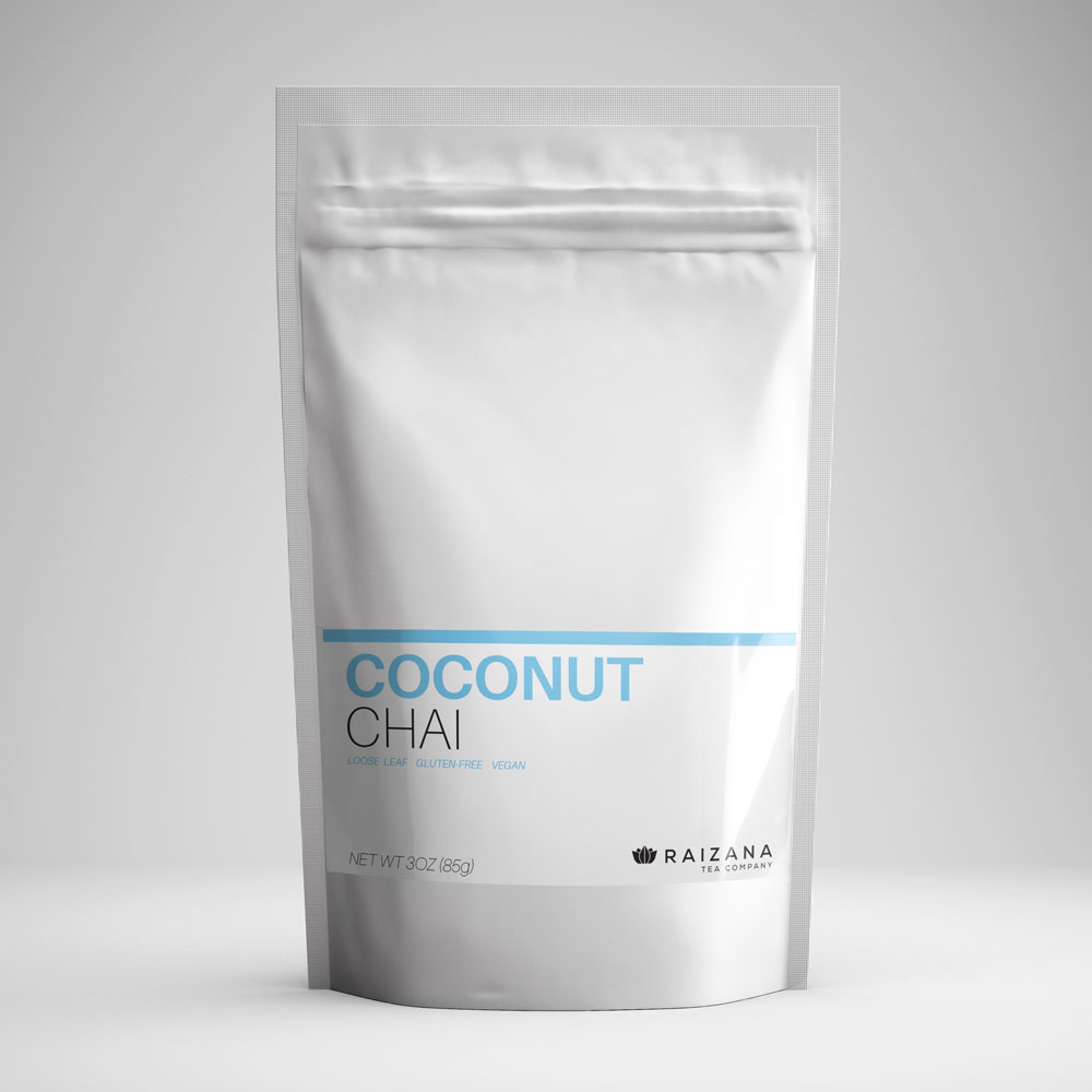
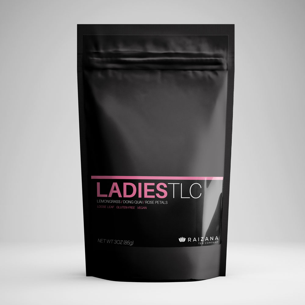
While brainstorming with Pablo and other top Raizana employees, we decided to use minimalist, color-coded packages to make the teas stand out on the shelf.
My vision was to ship wellness teas in black and sipping teas in white, accenting each flavor’s packaging with a unique color. By keeping the labels crisp and clean, we came to the current look – sexy and stylishly uncluttered packages of great tea.
The redesign paid off immediately. Raizana’s customers loved the new packaging both on social media and on the floor of the Fresno Food Expo. According to Pablo, some people bought the tea just to have the new labels in their kitchen.
Services
Packaging, Logo Refresh, Postcards, Business Cards

